MyPass — Industry Portal
A User-Centric Approach to Enhance User Experience and Functionality for a Complex B2B SaaS Platform.
This UX case study delineates the redesigning journey of the MyPass Industry Portal, which was carried out to enhance its usability and incorporate new features. The original portal was outdated with a cluttered interface and confusing navigation. The redesign aimed at simplifying the user interface, improving navigation, and adding new features like project and supplier management, as well as workflow creation, making the portal more scalable and flexible to cater to various organizational needs.
MyPass Global is a leading provider of workforce management and compliance software. Their industry portal is used by a wide range of companies to manage their workers' skills, qualifications, and compliance status.
Problem
The original MyPass Industry Portal was outdated and difficult to use. The user interface was cluttered and the navigation was confusing. The portal also lacked some key features, such as the ability to create and manage projects, send requests to external suppliers, and create custom workflows.
Objectives
The project focused on redesigning the MyPass Industry Portal to make it more user-friendly and to add new features. I worked closely with the MyPass team to understand the needs of their users and to develop a new design that would meet those needs. It focused on the following goals:
Improve the overall user experience by simplifying the user interface and navigation.
Add new features that would be valuable to MyPass users, such as project management, supplier management, and workflow creation.
Make the portal more scalable and flexible to meet the needs of a wide range of organizations.
Discovery Phase
I used a user-centred design approach to redesign the MyPass Industry Portal.
I began by conducting user interviews to understand the needs and pain points of MyPass users. I also analyzed the existing portal to identify areas for improvement.
Once I had a good understanding of the users and the portal, I began to develop wireframes and prototypes to test my design ideas with users. This allowed me to get feedback on my designs and make necessary changes before moving forward.
User flow Improvements
The new portal includes several user flow improvements and redesigns. For example, the new workflow creation allows users to add existing and new fields to each workflow step. This flow has been designed to take in consideration different type of user that could approach the task in different way. The user can start the flow by creating a new workflow and a fields to workflow steps or visa versa by creating fields and adding it into a workflow step.
Global Navigation Improvements
The header component provides a consistent and easy-to-use navigation experience for all products in the product suite. The header contains menu items that provide navigation to the different products and features in the product suite, as well as utility icons provide access to frequently used features such as notifications and account settings.
The header is designed to be consistent across all products, which makes it easy for users to navigate between products and to be efficient, with all of the most important navigation elements and icons readily accessible.
The header is divided into two sections:
Menu items: The menu items are located on the left side of the header. They provide navigation to the different products and features in the product suite.
Utility icons: The utilities are located in the right side of the header. They provide access to system-level functions such as search, notifications, and account settings.
Some of the Menu Items have a dropdown menu. This menu allows the user to reach recently opened records and perform actions such as creating a new record in a way that is intuitive, efficient, and accessible.
The dropdown menu is also designed to be accessible to users with disabilities. The buttons are keyboard accessible and the menu can be operated using screen reader software.
Component Design
The new MyPass Industry Portal features a number of improvements, including:
Data-table Component
The new portal uses a table design to display different types of data, such as worker information, project information, and supplier information. Each data type has its own visualisation and interaction, making it easy for users to find and understand the information they need.
Filtering
The new portal allows users to filter data based on different criteria, such as date, currency, and users. This makes it easy for users to find the specific information they are looking for.

Selection Component
The selection UI component with details on side is a useful tool for complex data sources where the item label is not enough for the user to pick an item. This is because it allows the user to see more information about an item before selecting it. This can be especially helpful for data sources such as company, roles, or personnel lists, where there may be many items with similar labels.
UX Case Study
Imagine a user is trying to select a company from a list of companies. The list contains the names of the companies, but the user does not know enough about each company to make a decision based on the name alone. The selection UI component with details on side can help in this situation.
When the user hovers over a company in the list, a panel appears on the side of the screen that displays more information about the company, such as its address, phone number, website, and industry. This allows the user to quickly scan the additional information to determine if the company is a good fit for their needs.
The user can also select multiple items from the list. This is useful for tasks such as adding multiple companies to a project or sending a message to multiple people.
Component Variants
One variant of this component that can be especially useful is the selection UI component with dropdown. This component adds a dropdown menu to the details panel that allows the user to add a property to the selection. This can make the user flow quicker by eliminating the need to switch to a separate screen or modal.
This variant of the selection UI component can be used to add any type of property to a selection, such as a role, a team, or a status. It can be a very useful tool for streamlining workflows and making it easier for users to complete tasks.
Benefits
The selection UI component with details on side has several benefits, including:
It allows users to quickly and easily see more information about an item before selecting it.
It is especially useful for complex data sources where the item label is not enough for the user to make a decision.
It allows users to select multiple items, which can be useful for tasks such as adding multiple items to a project or sending a message to multiple people.
Table View
The new portal includes different table views based on project, roles, and supplier. Each view is unique based on specific user profile needs.
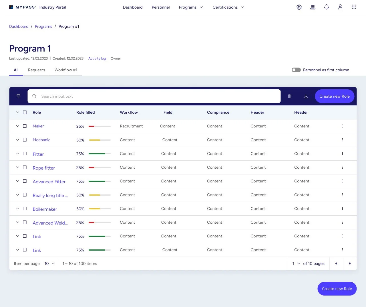

Rows can be expanded (accordion) to reveal additional information.

Additionally, when the user selection one or more items a contextual menu is displayed allowing specific actions.

The filter bar component placed above the table in the image allows users to highlight specific values or fields in the table, and to filter the table based on the highlighted values. This is useful for finding specific information in large tables or tables with complex data.
The filter bar is a powerful tool that can help users to quickly and easily filter tables. It is a valuable component for any table that contains a large number of rows and columns, or complex data.
The filter bar component can help the project manager to do this by allowing them to filter the project table based on specific criteria. For example, the project manager could filter the table by task status to see all of the tasks that are currently in progress or overdue. The project manager could also filter the table by team member to see how each team member is performing.

The filter bar component can help the project manager to do this by allowing them to filter the project table based on specific criteria. For example, the project manager could filter the table by task status to see all of the tasks that are currently in progress or overdue. The project manager could also filter the table by team member to see how each team member is performing.
Multi-layered Flow Using Modals
One of the key design decisions I made was to use modals for the project creation flow. Modals are a good way to present complex information in a user-friendly way. They also allow users to complete multi-step flows without having to leave the current page. The use of modals makes the process efficient and user-friendly. The ability to overlap modals is useful for complex flows that require users to enter information from different sources.
Benefits
There are several benefits to using modals for complex flows:
Focus. Modals can help to focus the user's attention on the current task. This is because modals block out the rest of the page, so the user can't get distracted by other elements.
Efficiency. Modals can help users to complete complex flows more efficiently. This is because modals allow users to stay on the same page and avoid having to switch back and forth between different pages.
Flexibility. Modals can be used to create a variety of different types of flows, including linear flows, branching flows, and parallel flows.
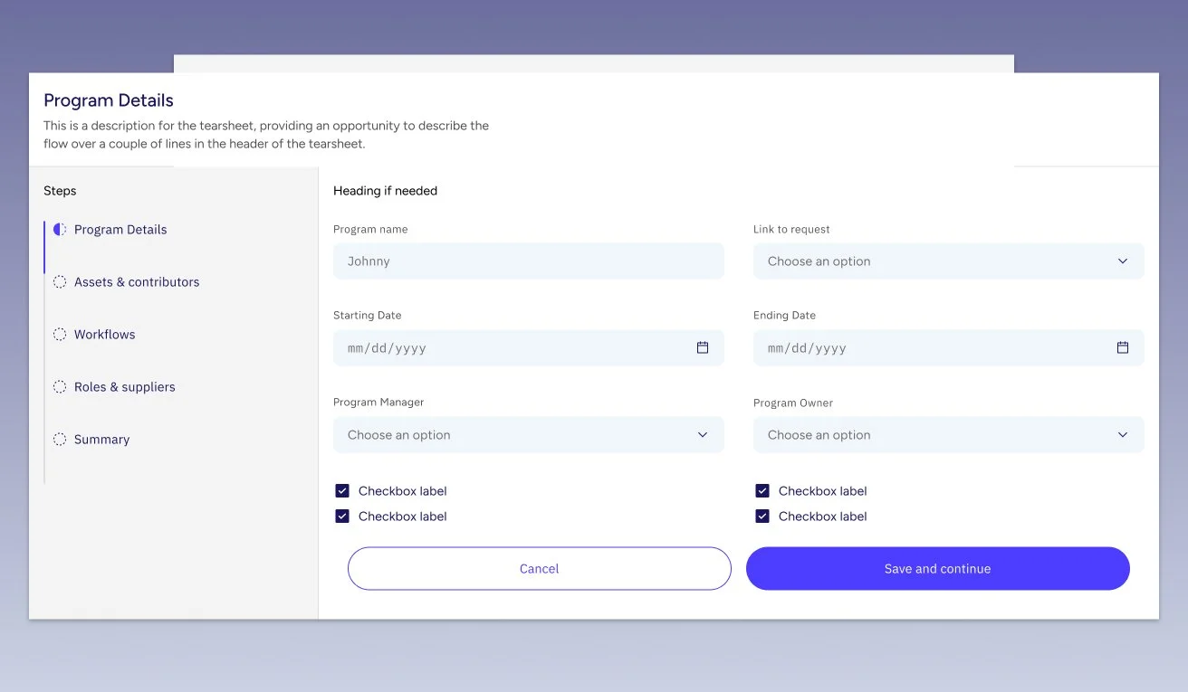
The user can complete multi-step flows in the modal. The steps are visible and accessible on the side of the modal. Multiple modals can be overlapped to create multi-layered flows.
Implementation
I worked with a team of developers to implement the new MyPass Industry Portal. We used a variety of technologies, including React, Redux, and Node.js.
We also built a Design System that provides a set of reusable components and patterns for building user interfaces.
Results
The new MyPass Industry Portal provides a number of benefits to users, including:
Improved user experience. The new user interface is simpler and more intuitive to use.
New features. The portal now includes new features such as project management, supplier management, and workflow creation.
Scalability and flexibility. The portal is more scalable and flexible than the previous version, so it can meet the needs of a wider range of organisations.
Additionally, the use of modals makes the process efficient and user-friendly. The ability to overlap modals is useful for complex flows that require users to enter information from different sources.