QBE — Vehicle Cover
Streamlining Vehicle Insurance
This UX case study delves into the redesign of QBE's vehicle insurance enquiry process. The project focused on streamlining the user experience, simplifying forms, introducing auto-complete fields, and providing instant quotes. A personalised dashboard and a clear information hierarchy were implemented to improve user management of covers. This case study explores the comprehensive UX improvements that enhanced user engagement and satisfaction.
The redesign of the QBE vehicle cover form makes the enquiry process faster by reducing the number of questions and presenting them in a more intuitive UI.
A newly designed dashboard helps the users to manage their covers and understand the benefit of the different offers.
An initial discovery phase has been conducted to identify the user goal and pain points related to car insurance quote.
A survey highlighted that most of the costumes aren’t aware of the average cost of an insurance premium. Their goal is to receive a quote as quickly as possible. However, there is a minimum requirement of information that the prospect has to provide to receive an insurance premium quote. In a workshop with the stakeholders, this required has been identified and grouped in affinity clusters.
The information architecture has been explored and validated via a treejack and card sorting testing in Optimal Workshop.


During the ideation process, low fidelity wireframes have been designed to define the page structures, the relation between the fields.
To guide the user in the process, different solutions have been tested including chatbot and tooltips.
Forms
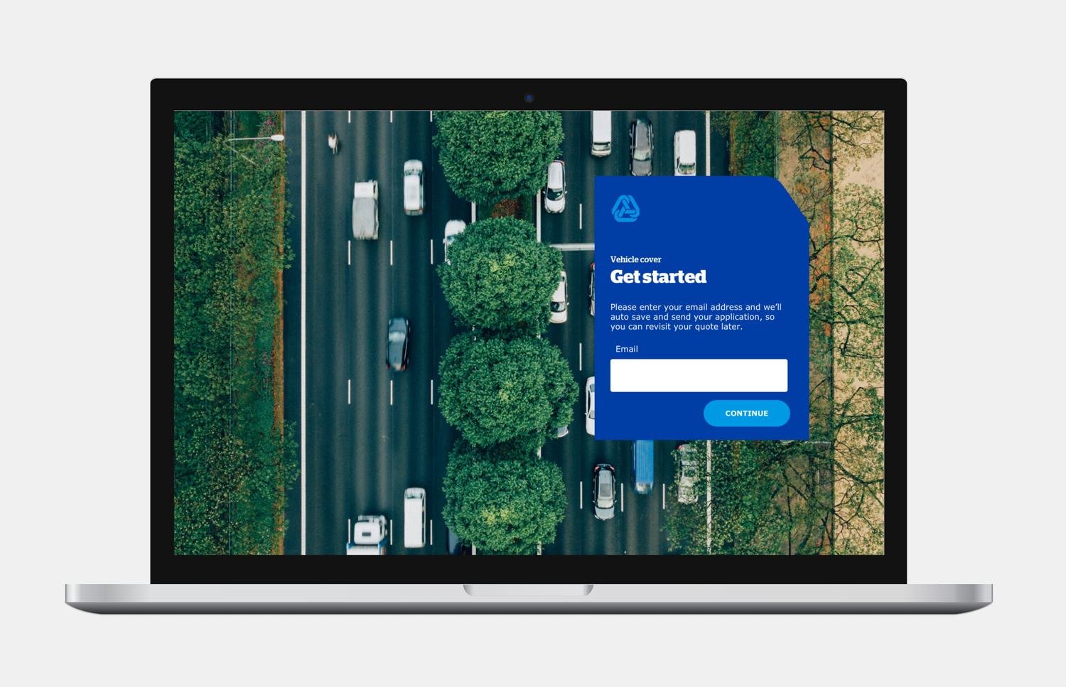
Before the users start the form, they are informed of the competition time and the information required which resulted in a decrease in drop rate. Users are invited to insert their email address (optional field) to save the form at any time. This feature is available at any step of the journey.
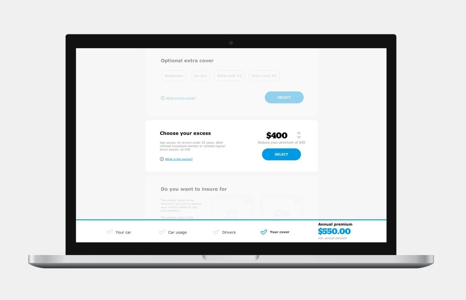
The form is designed to display a question a the time avoiding to overwhelm the user while the progress bar gives a clear feedback on the status of completion of the form.
The interface is designed to keep all the information available at a glance without the need to scroll significantly increase the completion speed specially on mobile.

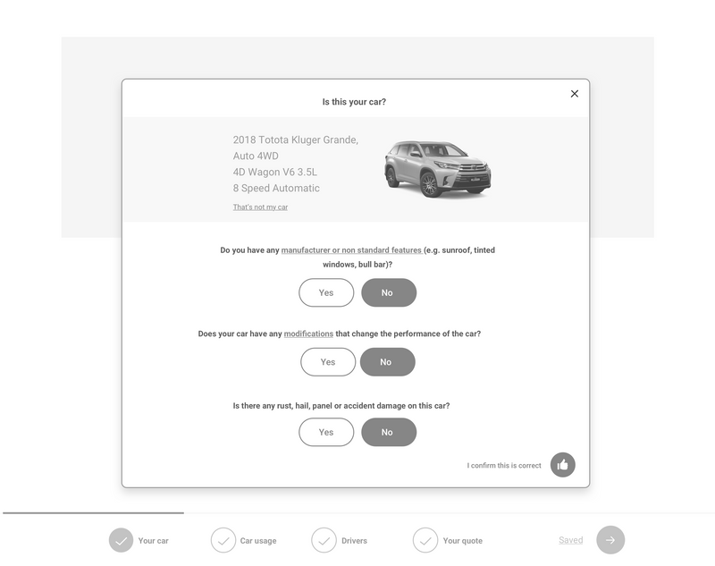
User testing revealed that many users do not remember the plate number of their vehicle. An option to find a car by model has been added

Visuals such as the image of the car model are added to give recognisable feedbacks to the users.

UI elements such as radio buttons have been modified to host intuitive icons making the UI easier to scan.

Information in the cards is designed to avoiding the needs of swipe by showing the comparison between the different options on each card.
Auto-complete fields
Auto-complete fields have been implemented to reduce the completion time.
Address field use the Google map API to auto-complete the input. Using the Google API it is also possible to check if the local is related to a business, the result is used to pre-filled upcoming questions in the form.
Quote
Most users aren’t aware of the average cost of an insurance premium. Their goal is to receive a quote as quick as possible.
As soon as the minumun information are captured an initial quote is displaid. The quote is update as the users continue the form.

The users can compare and refine different packages. The relevant information about each package are clearly made available to the users.
Dashboard
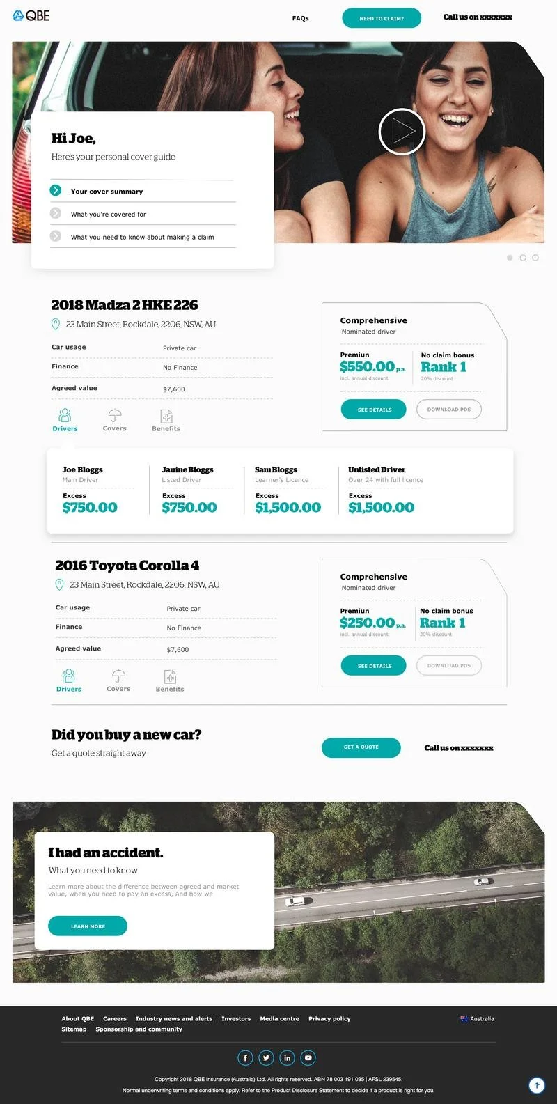
Users can manage their covers by using a personalised dashboard.
The main navigation is reduced to three specific call to actions. The top and the bottom panels hosts personalised offers to incetivate the users to return in the page more often.
A menu icon has been added under each product overview so the user can quickly access relevant information directly in the page and compare the products.
The interface has been designed to host all the information the user needs with a distinct thanks to a defined hierarchy
The users can compare and refine different packages. The relevant information about each package are clearly made available to the users.
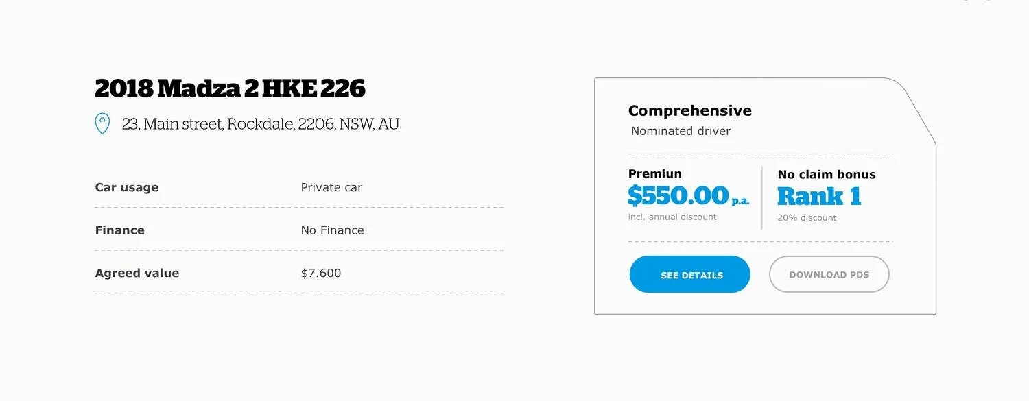
The annual premium is one of the most relevant information for the users. It is displayed against the rank highly to the user the relation between the two. The hights is the rank the lower is the premium.
Each veichle has a dedicate page so the user can see the details of the insurance cover.
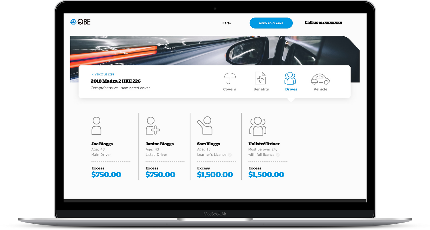
Surveys showed the customers with an insurance policy which cover multiple drivers are often not aware of variation of excess based on the driver.
The drivers list shows the excess of each driver based on their age and license type.
Page structure

By combining the information collected in user interviews and behavioural observations has been identified that the majority of the customers looks for a few specific factors in when they choose insurance for their vehicle.
The policy information has been divided in two sections: covers and benefits.
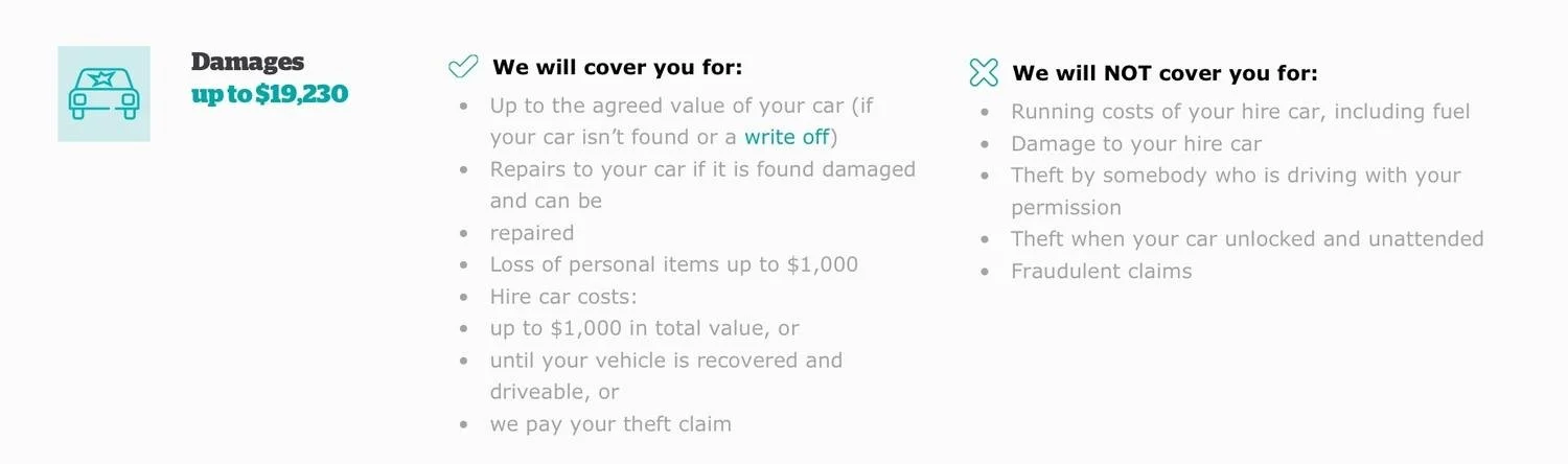
Covers
The covers page list the core features of the policy. Those are the main information the user looks for when they choose a policy.

When the user purchases the insurance package they can choose some extra covers. This structure is maintained in the dashboard.

Benefits
The benefits are the specific insurance policy. Those benefits vary depending on the vehicle cover package.
Sale data revealed that many costumers that purchase a low tier package, tents to upgrade their vehicle cover package after the first year. This behaviour is associate with the marketing materials sent to the user at the time of renewal.
The benefits of the cover package are listed in a table format so the users can compare the current plan with others available.
The comparison table has contributed to increasing the number of customers which has upgraded their cover package within the first year
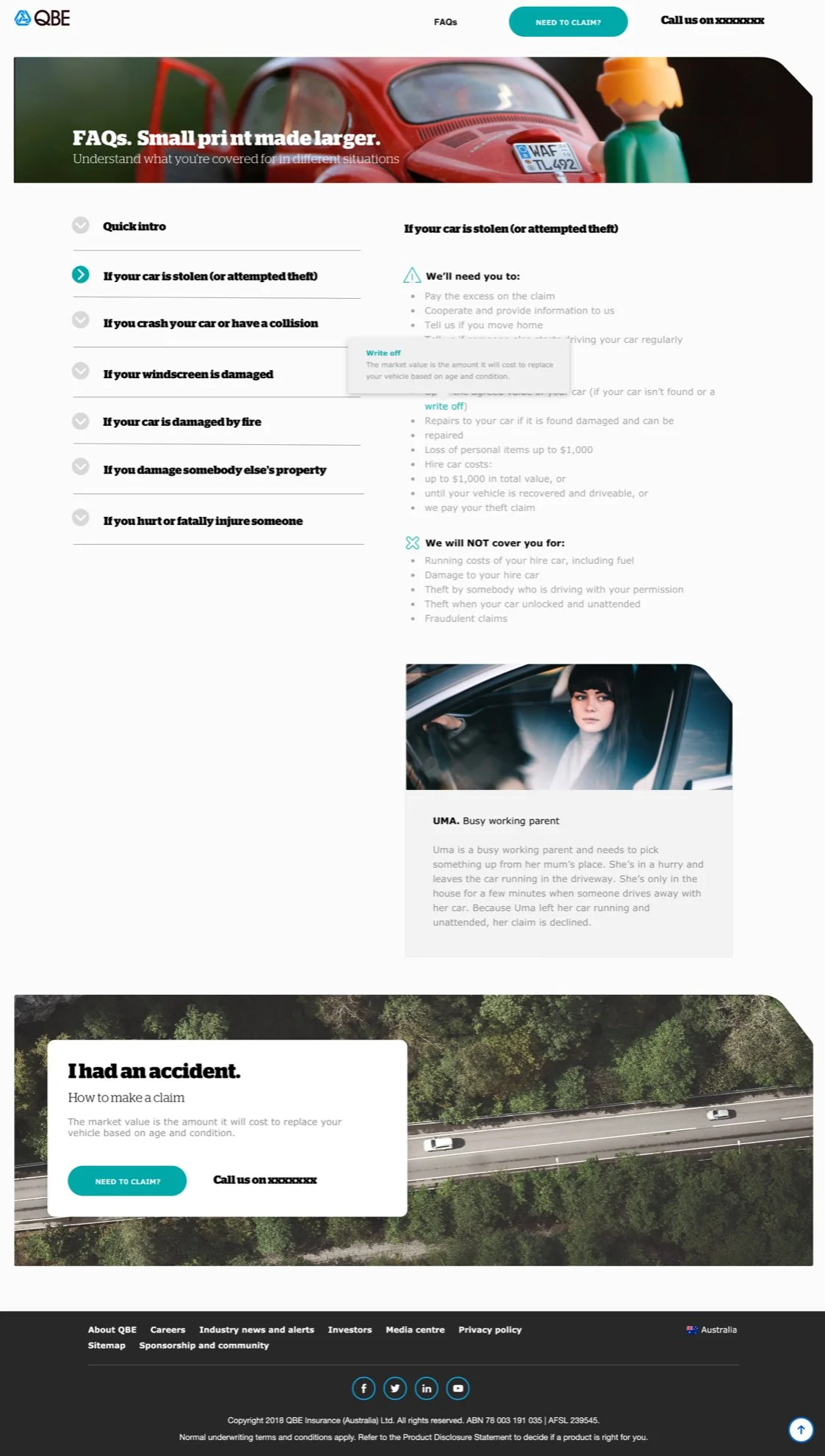
FAQs
Many users are not familiar with the terminology used in the insurance term and conditions. Tooltips have been added to make the information more accessible and add a layer of information.
NEXT PROJECT