VLSB+C
Improved VLSB+C Website UX
This UX case study delves into the journey of VLSB+C, a legal services organisation, as they revitalised their online presence through a user-centric approach. Faced with the challenge of improving accessibility and clarity, the project aimed to cater to the diverse needs of both legal practitioners and consumers. Through interviews, landscape reviews, and usability testing, this study explores the evolution of VLSB+C's information architecture and user interface. The findings reveal the significance of a well-structured website in building trust, offering support, and enabling digital self-service. This transformation, resulting in improved findability and user satisfaction, underscores the importance of user experience design in enhancing an organization's digital footprint.
VLSB+C's online presence received a significant boost through a revamped information architecture and user interface. The redesigned website ensures a user-friendly and accessible experience, catering to the needs of both consumers and legal practitioners.
Objectives
1. Control the narrative and effectively communicate with key audiences.
2. Establish a unified and comprehensible language and identity.
3. Foster trust between the legal profession and consumers.
4. Empower consumers to understand VLSB+C's support.
5. Provide valuable support for legal practitioners.
6. Promote digital self-service as the primary channel.
7. Ensure easy access to critical items, such as the public register of lawyers.
Interviews
We conducted nine face-to-face interviews with internal stakeholders to understand their website-related goals and gather insights on how to better serve practitioners and consumers.
Additionally, we conducted five interviews with practitioners and four with consumers to gauge their perceptions of VLSB+C and their website-related objectives. Their input was invaluable in identifying areas for improvement.
The interviews highlighted that the existing website lacked a clear information structure, making it challenging for practitioners and consumers to find the information they needed.
Practitioners typically accessed the website directly but struggled to locate the registry of lawyers and disciplinary actions—services of great importance to them.
Consumers primarily found the website through Google Search, but navigating to content relevant to their needs required sifting through several pages.
Many participants expressed a preference for a clear separation of content between 'Lawyer' and 'Consumer' focused information.
Landscape Review
We conducted a landscape review to gain insights into information architecture, navigation patterns, and web concepts within related industries, with a particular focus on legal and government services.

Information Architecture
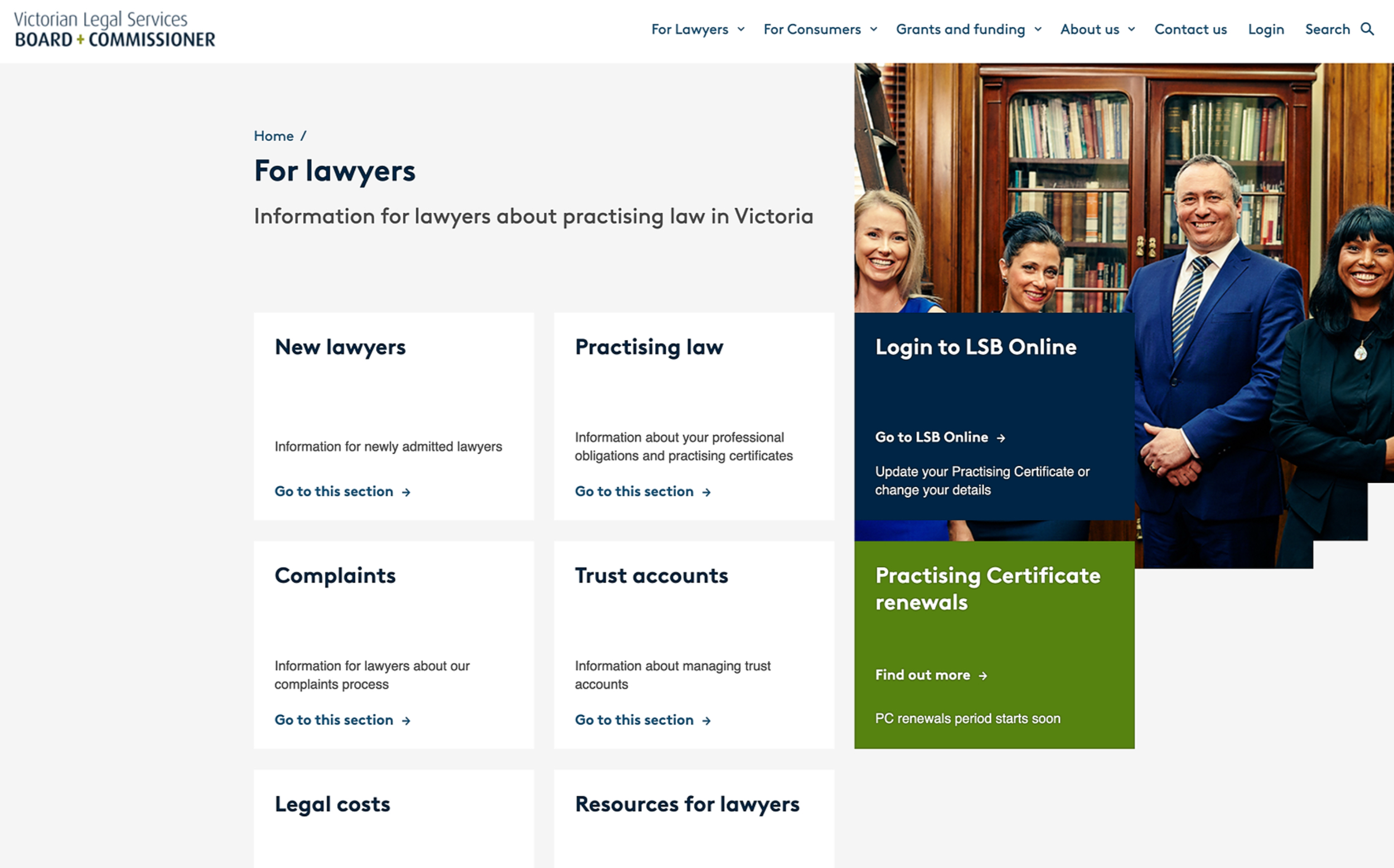
The redesigned website serves as VLSB+C's primary means of communication with the public. Our new design focuses on delivering the right stories to the right audience.
The primary navigation has been organized into three core sections: lawyers, consumers, and those seeking funding.
We introduced a global search function to enable users to find all types of content in one place.
The site structure supports dynamic content and storytelling through news with well-considered taxonomy/categories, case studies for transparency and expectations setting, and strategically placed related content and links throughout the website.

Treejack Test and Validation
To assess the usability of the proposed information architecture, we conducted a Treejack test with five tasks related to content location. Task order was randomized for each participant.
We further validated the information architecture through nine usability testing sessions on high-level wireframes, ensuring diversity in participant profiles.

Success Rate
We achieved a 71% success rate from 61 responses overall.
Lawyers/Legal professionals achieved a 54.8% success rate from 18 responses.
Internal staff reported a 77.6% success rate from 43 responses.
Solution
To address user pain points related to information retrieval, we implemented specific search queries, filters, and suggested queries for improved search results.
Fact sheets tailored to common customer and practitioner needs were created, covering various legal service topics.
First-level pages now guide users to content pages relevant to their specific needs.
Second-level content pages allow users arriving from Google Search to navigate contextually. Anchor links facilitate in-page information retrieval, and a contextual menu on the right aids navigation within audience-specific sections.
Documents and external links are prominently highlighted for user convenience.

Navigation is facilitated through dropdown menus, enabling users to explore second-level pages under each first-level section, thus helping them discover content specific to their audience.

NEXT PROJECT