General Pants Co.
Targeting Shopper Archetypes for Improved Product Exploration
General Pants Co. embarked on a journey to optimize their e-commerce platform through meticulous UX research and UI design. The primary objective was to provide users with an engaging interface and a streamlined filtering system to encourage product exploration. By analyzing user behavior data, two distinct shopper archetypes, "Product-focused" and "Explorer," emerged as the focal points for design enhancements. This article delves into the challenges faced, solutions implemented, and the impact on user engagement, specifically addressing issues around product categorisation, style inspiration, and an improved filtering experience.
Objective of the experience design is to guide the users in exploring more products by offering a visually engaging UI and a simplified filtering system.
Every element of an e-commerce site is important for the site's success, from product images to descriptions to registration to checkout. But different types of shoppers rely on different elements of the site.
By analysing data related to the user's behaviours two main shopper archetypes have been identified and targeted:
Product-focused. Shoppers know exactly what they want. They need a replacement for something they already have. They’ve done previous research and have picked the item that they want.
Behavioural metrics:
Access to the website via organic search by query related to a specific brand or product category.
Navigate directly to a product category.
Use of filters.
Had less than two sessions in the last two weeks.
Explorer. Leisurely shoppers who go to their favorite sites or new sites for inspiration or to kill time. Browsing shoppers want to stay up on the latest trends, dream of future purchases, or looking online in advance of a visit to a store.
Behavioural metrics used to define those users:
Access to the website via direct traffic or via brand keywords search if search organic traffic.
Browse multiple product categories and styles.
Clicks on the related links.
Add item/s in the cart and close the session without buying.
Had more than two sessions in the last two weeks.
Problem statement
E-commerce is performing well for the user under the explorer segment.
However, it has been observed that 64% of the users in the Explorer segment that land in the product category leave the website without opening any specific product page.
The main areas of improvement have been identified around the filtering functionality and the page layout.
Solution
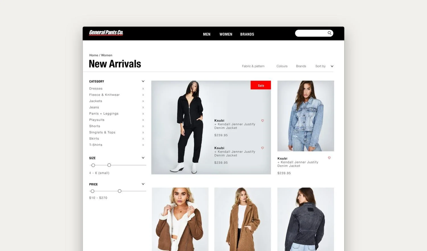
Categories
In the current design there is no way to differentiate items other than by visual observation. The large amount of items increases cognitive load and causes choice paradox.
The category section targets Explorer persona archetype by directing this kind of users to specific items category.

Differently, from the mega-menu dedicated to the hunter persona archetype, this section uses visuals to capture the attention on the Explorers. Labels have been added to make categories easier to recognise.
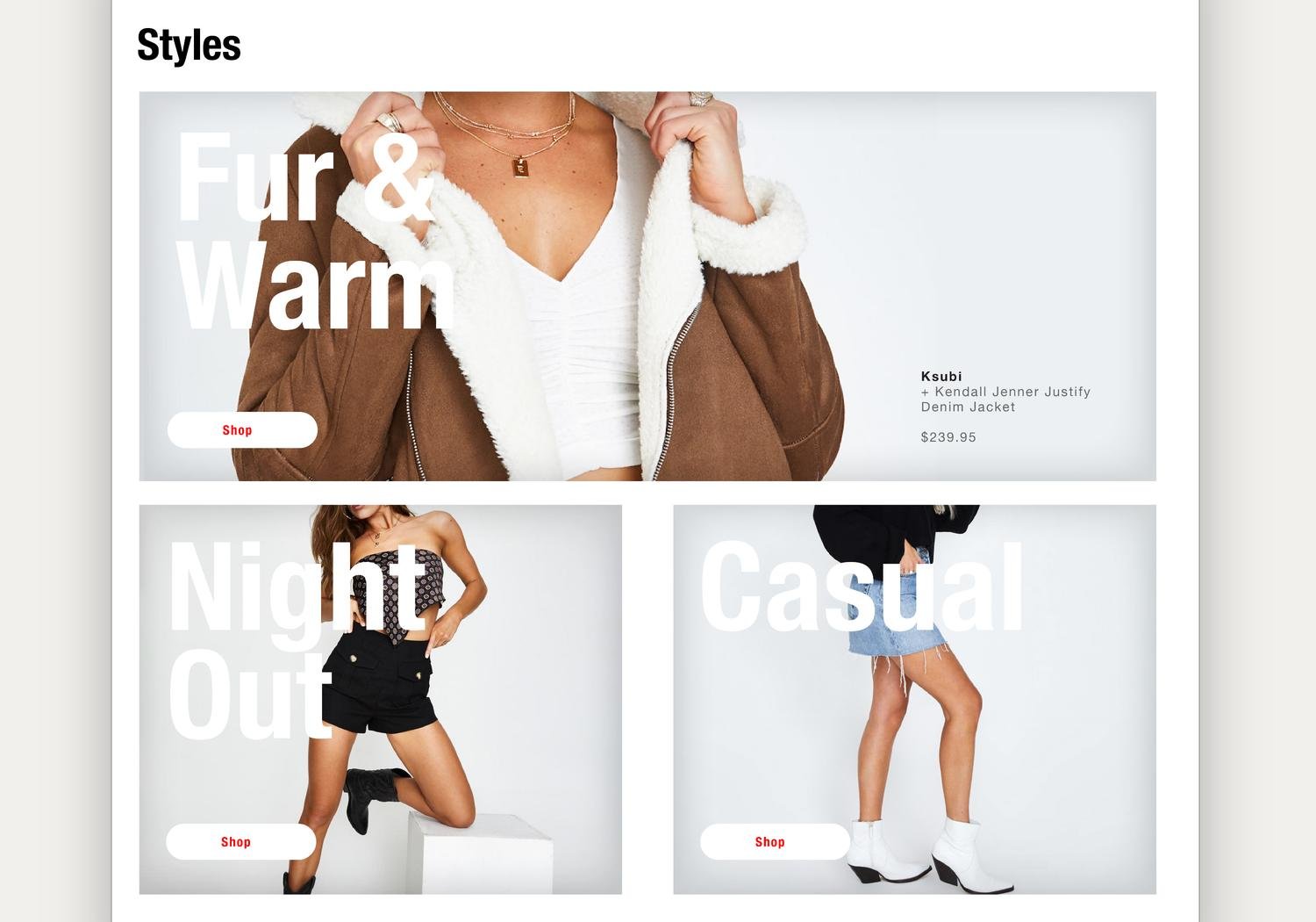
Styles
Styles have curated a collection of items. This section is designed specifically to around explorers users by inspiring them with trendy collections.
Filters
The filters have been divided in two: a list on the left side and dropdown menu on the top. The objective is to reduce the number of options presented to the user at the same time and create a clear distinction between the two filters.
Filtering by removing
In the current design the filter results widget is long and requires a user to scroll up and down after a selection is made.
For most of the users, it is easier to know what they are not interested. The user can remove the item’s category by click on the (x).


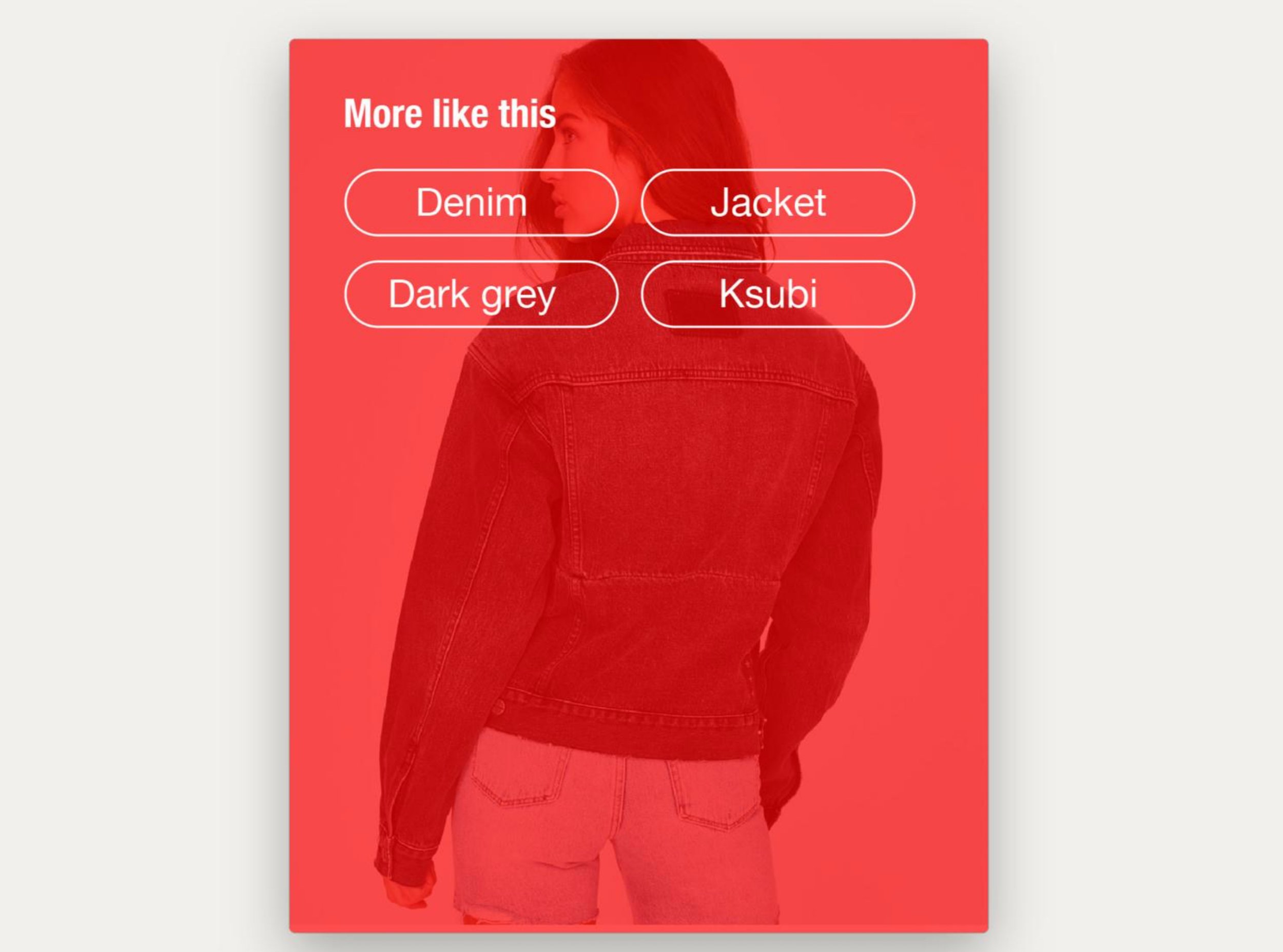
Filtering by similarity
If the user likes a specific item by using the “find similar” function, it can create a filter setup based on the item selected.
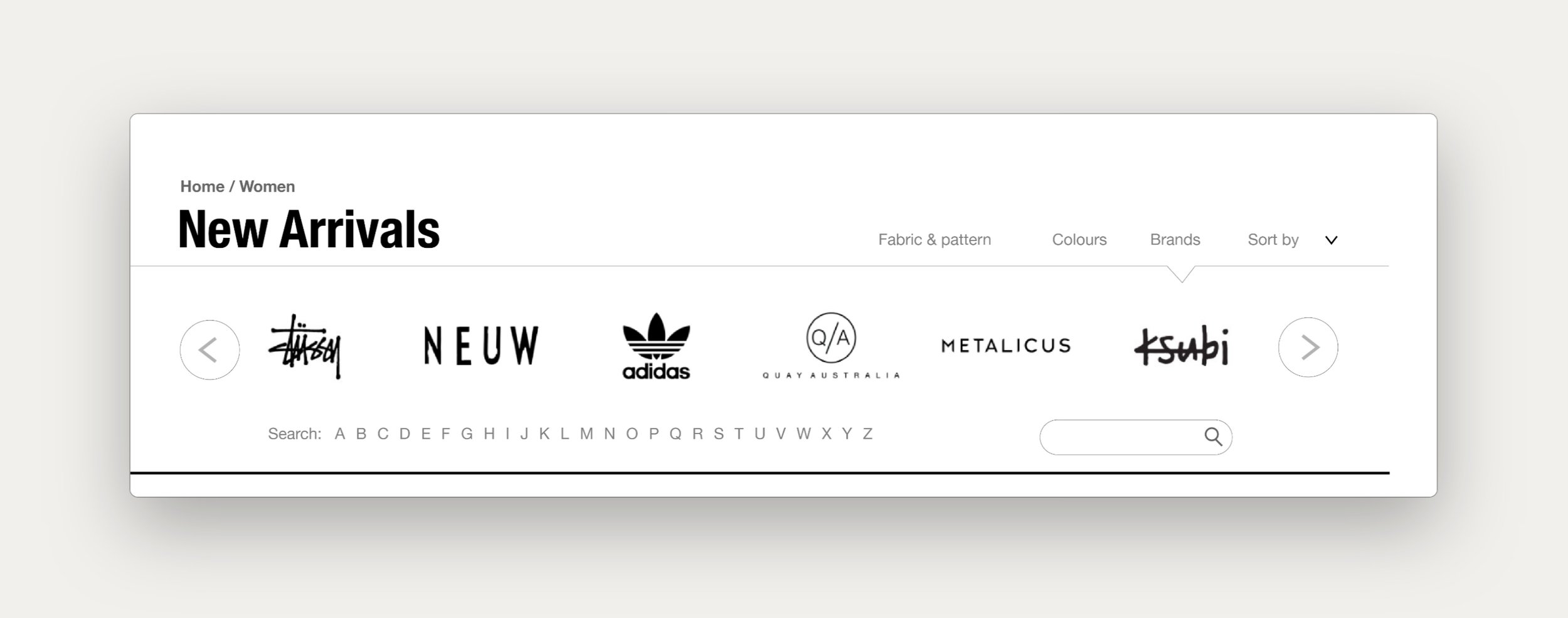
Filtering by colours and brands
Filtering by colours and brands are designed to be more attractive and based on visuals. Especially for brands, the users tend to recognise brands visually rather than by name. Additionally, the new design is less overwhelming for the user.

NEXT PROJECT