Vodafone. A Case Study in Hypothesis testing for Enhanced Offer Fulfillment
This case study examines the launch of Vodafone’s “Prepaid Plus” plan and the subsequent efforts to optimize its presentation and user experience to drive customer adoption. Vodafone launched the innovative "Prepaid Plus" plan, offering recharges starting at $30. This plan included unlimited national calls and SMS (with international options), full-speed data, and Infinite data (unlimited data usage at 1.5Mbps speeds). "Prepaid Plus" aimed to replace the previous "Combo" plan, supported by a strategic campaign to encourage customer migration
Initial Challenges and the Need for Optimization
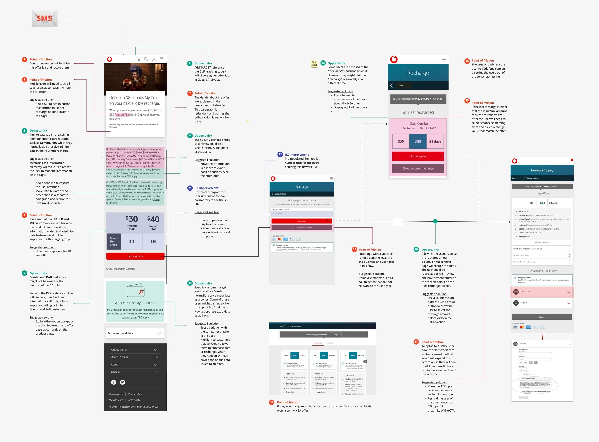
Complex User Flow: The steps to migrate to Prepaid Plus were convoluted, hindering user comprehension and completion of the recharge process.
Typographic Hierarchy Issues: Key information about the plan, such as data allowance, cost, and recharge expiry, lacked clear visual prominence, making it difficult for users to quickly grasp the offer’s essentials.
Distracting Elements: Unnecessary elements on the landing page competed for user attention, potentially obscuring the core value proposition of the Prepaid Plus plan.
High Exit Rate: A significant number of users were abandoning the landing page without completing the desired action (migrating to Prepaid Plus), signaling potential usability issues or a lack of compelling information.
Misleading “Same Again” Option: The “Same Again” option within the Express Recharge feature inadvertently allowed some existing Combo customers to recharge their old plan without considering the benefits of Prepaid Plus.
“The findings from the heuristic review provided valuable insights into specific areas where the user experience could be improved. By addressing these issues, Vodafone aimed to create a more seamless and user-friendly experience for Prepaid customers, leading to increased customer satisfaction and higher conversion rates.”
The 'Same Again' option in Express Recharge led some Combo customers to tap without considering offer details, potentially missing out on rewards
A User-Centered Design Approach to Enhance the User Experience
Recognizing these challenges, Vodafone adopted a user-centered design approach to optimize the presentation and user journey for the Prepaid Plus plan. This involved a systematic process of identifying pain points, generating solutions, and validating those solutions through testing and iteration.
The 'Same Again' option in Express Recharge led some Combo customers to tap without considering offer details, potentially missing out on rewards.
The primary focus of the redesign was the Prepaid Plus landing page, the initial point of contact for many potential customers. The goal was to create a clear, concise, and engaging experience that would effectively communicate the value proposition of Prepaid Plus and guide users toward completing the recharge process. The redesign incorporated the following key elements:
Prioritizing Key Information: Essential plan details, including data allowance, cost, and recharge expiry, were prominently displayed, enabling users to quickly understand the core aspects of the offer. This addressed the initial issue of a weak typographic hierarchy and ensured that the most important information was immediately accessible.
“By adding primary information like data allowance, cost, and recharge expiry upfront, Vodafone aimed to immediately address users’ core concerns when considering a Prepaid plan. This transparency helps reduce uncertainty and encourages users to explore the offer further.”
Creating a Sense of Urgency: The offer expiry date was visually emphasized to subtly encourage users to act promptly and avoid missing out on the benefits of Prepaid Plus. This design choice aimed to counteract the tendency of some users to delay decision-making and potentially lose interest in the offer.
Showcasing Unique Selling Points: The three primary advantages of the Prepaid Plus plan—unlimited calls and SMS, full-speed data, and infinite data at reduced speeds—were highlighted in a clear and concise manner. This ensured that users could immediately grasp the core benefits that differentiated Prepaid Plus from other plans.
Integrating My Vodafone Credit Information: Information about My Vodafone credit and its use for purchasing add-ons was prominently incorporated into the landing page. This highlighted the flexibility and value of the Prepaid Plus plan, allowing users to customize their experience beyond the core offerings.
The redesigned landing page aimed to improve conversion by emphasizing key information, offer details, and the use of My Vodafone credit.
“Emphasizing the three unique selling points of the Prepaid Plus recharge reinforces the plan’s value proposition, helping users quickly grasp why this plan might be better suited to their needs than the previous “Combo” plan.”
Testing, Validation, and Projected Outcomes
The redesigned landing page was rigorously tested to validate its effectiveness in achieving the desired outcomes. A/B testing, comparing the redesigned version against the original, revealed a substantial improvement in offer fulfillment rates. The variation incorporating the redesign achieved a 7.7% offer fulfillment rate, a remarkable 119.25% increase compared to the control group’s 3.5% rate. This data, with a 95% confidence level, strongly supported the hypothesis that the redesigned landing page was significantly more effective in converting users to the Prepaid Plus plan.
“The increase of 119.25% indicates a substantial improvement in the effectiveness of the campaign, successfully encouraging customers to migrate to the new Prepaid Plus plan.”
The Importance of User-Centered Design in Driving Campaign Success
The Vodafone Prepaid case study exemplifies the power of user-centered design in optimizing marketing campaigns and enhancing the customer experience. By systematically identifying user pain points, iterating on solutions, and validating those solutions through rigorous testing, Vodafone was able to significantly improve offer fulfillment rates for the Prepaid Plus plan. This case study highlights the critical role of user experience design in achieving business goals and delivering value to customers.


