MyPass Global
Personnel Verification Made Simple, Secure and Strong
MyPass app, a product by MyPass Global, has undergone a meticulous journey of development, guided by a thorough UX case study that encompassed heuristic reviews, stakeholder workshops, market analysis, customer interviews, and rigorous testing. The result is a seamless and secure platform that empowers users to effortlessly manage their certifications and access privileges while offering enhanced security, streamlined functionality, and an unparalleled user experience.
MyPass Global offers a complete product suite designed to empower organizations. This suite comprises two essential components: an App for Workers and a Portal for Company Administration personnel. This versatile platform simplifies employee access to digital resources, as well as identity and document verification, making it an indispensable asset for businesses of all sizes.
The Worker App, a key component of the MyPass Global product suite, specifically targets workers in high-risk sectors like mining. It allows them to effortlessly manage their working compliance certificates, secure a verified digital identity pass, and efficiently coordinate their work with companies. While the research and design efforts extended to both the Worker App and the Portal, this case study primarily focuses on the Worker App.
Discovery Phase
Before conducting stakeholder interviews, a heuristic review was undertaken to evaluate the usability and user interface design of My Pass App and Portal. This review adhered to established usability heuristics and pinpointed areas requiring improvement, such as enhancing error message clarity, achieving visual consistency, and simplifying navigation.

UI and Usability Pain Points from Heuristics Review
Pain points identified during the heuristic review were systematically categorised by their severity and meticulously documented for resolution during the project's design phase. Some of the notable findings encompassed:
1. Inconsistent Design Elements. Inconsistencies in button styles, fonts, and spacing across various screens and sections of the app, leading to a lack of visual coherence.
2. Complex Navigation. Complex and non-intuitive navigation structures that made it challenging for users to find specific features or certificates.
3. Certificate Expiry Alerts. Insufficient and untimely notifications for certificate expirations, potentially causing compliance problems.
Stakeholder Workshop
A stakeholder workshop was conducted to gather valuable insights into the vision, goals, and requirements for My Pass. Key stakeholders from the product team, including product managers, developers, and designers, actively participated in this workshop. The primary objective was to align everyone's expectations and establish a shared understanding of the project, providing a solid foundation for subsequent design decisions.
Landscape Review
Furthermore, a comprehensive landscape review was undertaken to gain an understanding of the existing market, competitors, and trends associated with digital identity verification and access management. This thorough review facilitated the identification of opportunities for differentiation and innovation. By analyzing market trends and competitor offerings, the team gained valuable insights into potential features and functionalities that could set My Pass apart.
Customer Interviews
To delve deeper into user needs, pain points, and expectations, a series of interviews were conducted with workers, managers, and administrators. These interviews yielded valuable insights into access management processes, challenges, and desired features. The research underscored the urgent need for a streamlined solution in high-risk industries that regularly handle numerous certificates prone to expiration.
Persona Profile and Customer Journey Maps
Based on these customer interviews, a persona profile representing the primary user group was created. Additionally, customer journey maps were developed to illustrate typical My Pass usage, encompassing activities such as creating employee profiles, accessing certificates, and managing connections with companies.
Value Proposition Canvas
The Value Proposition Canvas emerged as a pivotal tool for aligning the customer's job-to-be-done, the actions required to achieve specific outcomes, and the associated pain points and gains with the actual product features. This canvas provided a structured approach to connect pain points and gains with potential solutions, ultimately fostering the generation of concrete product features or services that directly addressed user needs.
The Value Proposition Canvas serves as a crucial tool for aligning the customer's job-to-be-done, the actions required to achieve specific outcomes, and the associated pain points and gains with the actual product features. This canvas effectively connects pain points and gains to potential solutions, enabling the generation of ideas for concrete product features or services that address these needs.
One notable pain point identified in the value proposition canvas was related to concerns about personal data and uploaded certificates within My Pass. Leveraging the canvas, pain relievers were generated, including the ability to permanently delete certificates from the platform. Additionally, gain creators were conceived, such as granting users control over certificate visibility and offering the option to download digital copies of their uploaded certificates from the platform. These inputs, in conjunction with others, formed the basis for concrete service and product features through a prioritization process facilitated by a MaxDiff survey.
Prioritisation using MaxDiff Survey
To prioritize features and functionalities effectively, a MaxDiff survey was conducted among a representative sample of target users. This survey presented participants with various feature combinations, allowing them to select the most and least important features among these options.
For instance, stakeholders had considered adding a functionality for users to include certificates unrelated to a role or company, catering to those who use certificates for volunteering or personal purposes. As indicated by the landscape analysis and the value proposition canvas, this feature held long-term strategic value for the MyPass App.
However, the MaxDiff survey revealed valuable insights. It clearly highlighted that users had different priorities and concerns regarding features. This revelation enabled stakeholders to better understand their customers, align their priorities, and make more informed and strategic decisions regarding feature implementation.
The MaxDiff survey is a potent tool, particularly valuable when multiple stakeholders hold divergent opinions. It effectively captures the customer perspective by quantifying priorities through rigorous statistical analysis, providing clear and data-driven insights into preferences.
Information Architecture
Regarding information architecture, My Pass offered secure storage, verification, and management of certifications in digital format. To deliver a seamless user experience, polyhierarchy was employed in the information architecture. This approach allowed a single item to belong to multiple information architecture categories, accommodating users with diverse mental models. Consistent filtering functions were thoughtfully integrated, enabling users to efficiently sort items based on exceptions and verification status.
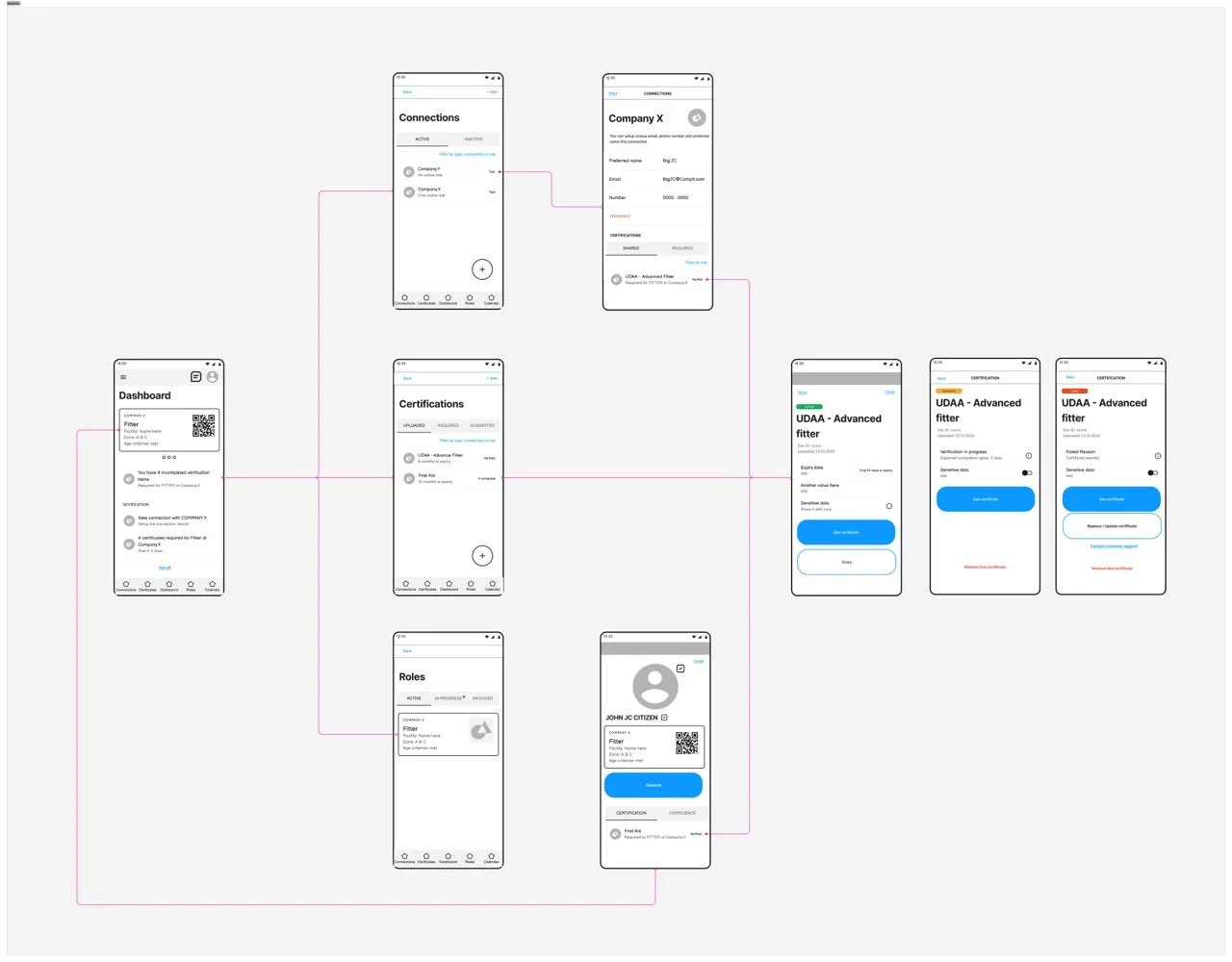
Users could effortlessly access their desired certifications within the My Pass app through primary navigation. This involved entering the "Certificates" section to access the complete list of certificates. For a more tailored approach, users had the option to navigate through the app in two additional ways. They could access the "Roles" screen, providing a role-centric view of their certifications, or explore the "Connections" (companies) screen to visualize certificates associated with each role within a connection. This multi-dimensional approach ensured efficient certificate location, aligning with users' unique needs and preferences. Furthermore, consistent search and filtering functions were thoughtfully integrated, enabling users to sort certificates based on exceptions and verification status.
Wireframes and UI Design
Wireframes played a crucial role in visualising My Pass's interface, with a focus on key screens like the user dashboard, certificate management, and personal profile. Special emphasis was placed on enhancing the dashboard, which houses the Notification Centre. This feature is vital for addressing certificate expiry alerts, and improving its usability and notification delivery were top priorities.
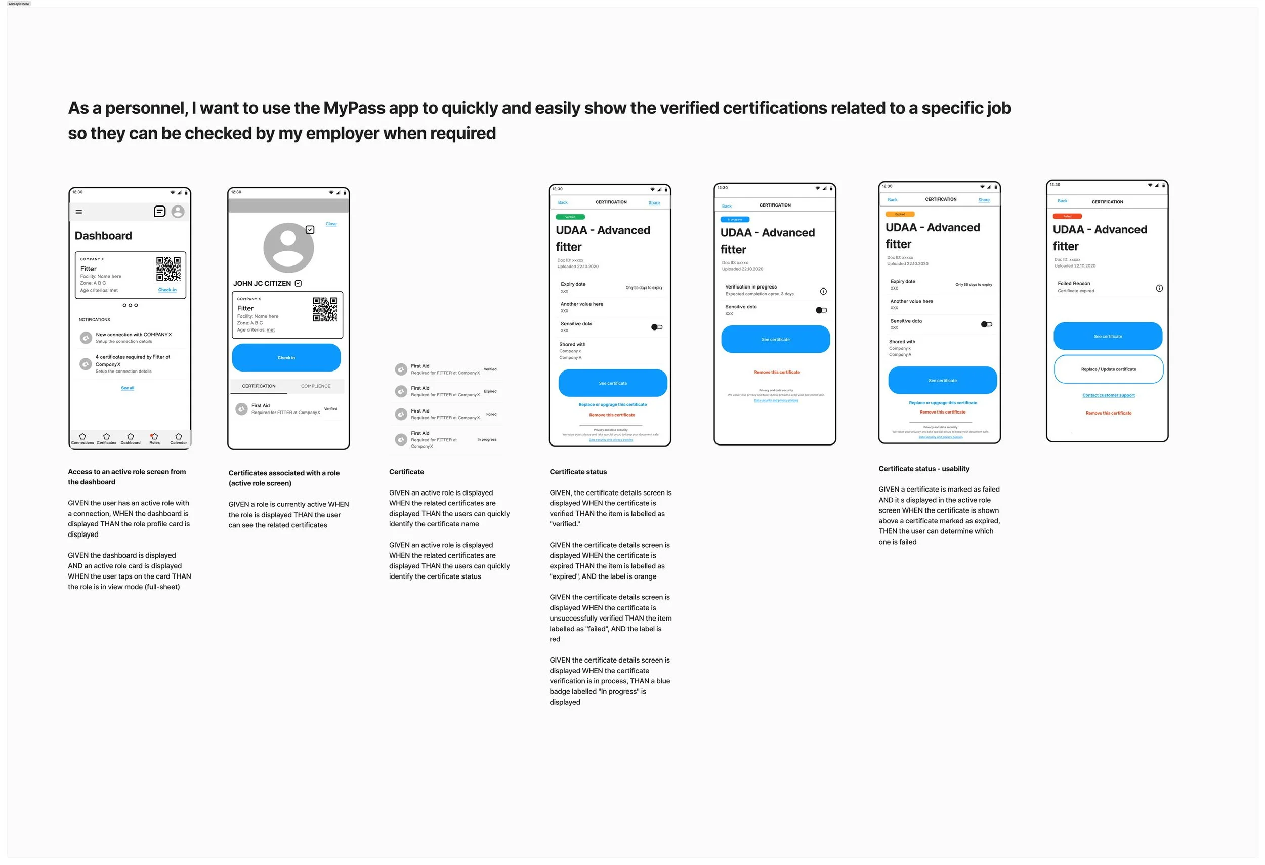
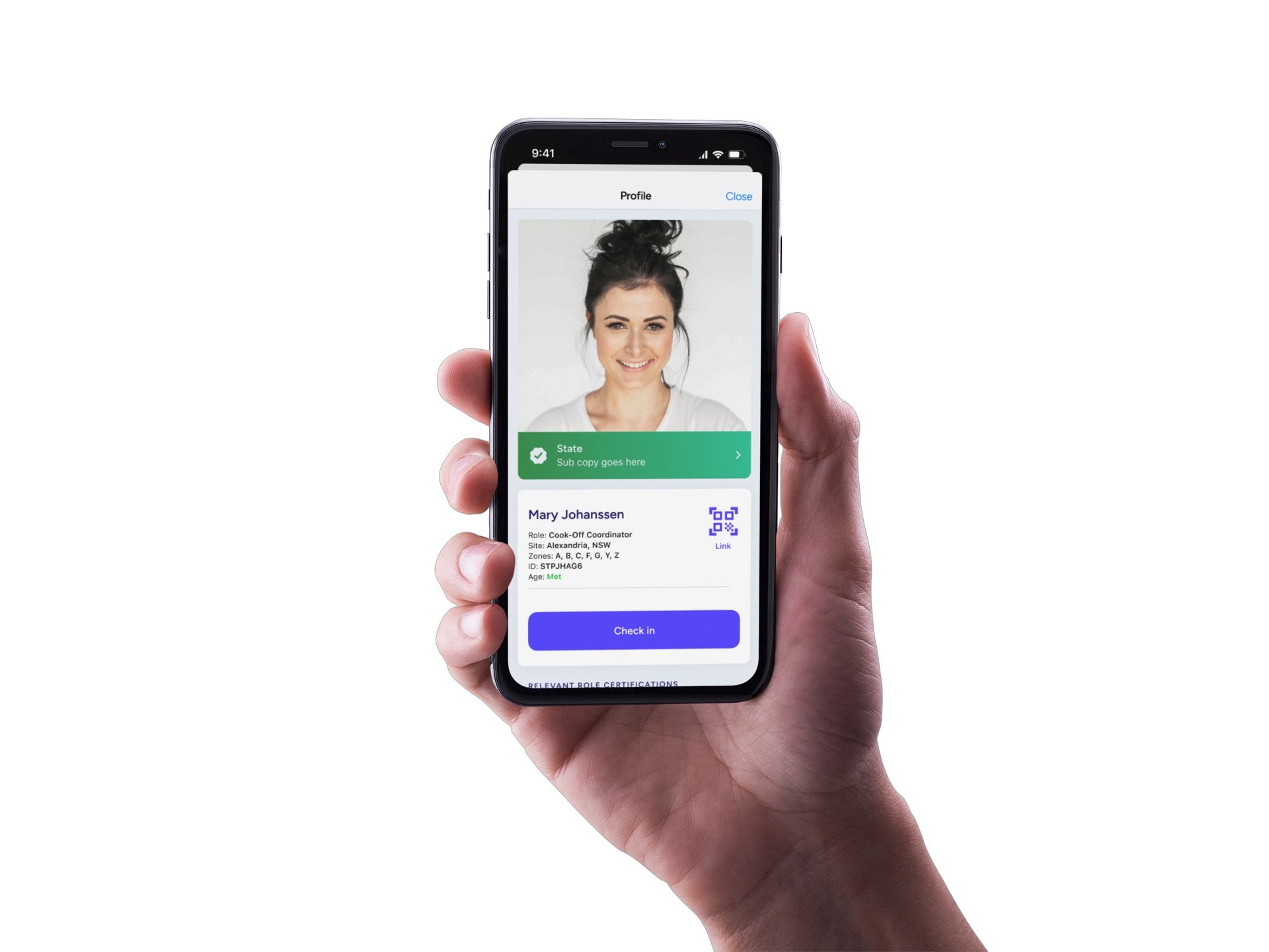
The status notification in MyPass employs a user-friendly design approach that aligns with native UI design systems familiar to users. It consists of two key components: a clear label that communicates the status (e.g., "Failed") and a sub-heading that provides additional context or information about the situation. This design not only ensures that users quickly grasp the essence of the notification but also offers them further insights into the issue at hand.

Additionally, the dashboard provides a rapid access to role-related certificates by presenting card-based UI elements listing active roles. With a simple tap, users instantly access certificates associated with each role, easily shareable through QR codes.
Prototype and Testing
A clickable prototype was developed based on the wireframes, facilitating usability testing sessions with representative users. This prototype enabled participants to interact with the system, providing valuable feedback on its usability, intuitiveness, and overall user experience. Insights gleaned from these sessions were instrumental in refining the design and addressing any usability issues.
User Stories and Acceptance Criteria
User stories and acceptance criteria played a pivotal role in ensuring alignment within the MyPass team throughout the app development process. These concise narratives not only provided a clear understanding of the app's features but also served as a bridge for effective communication with stakeholders. By outlining specific user interactions and expectations, they enabled developers to have a precise roadmap for implementation. Additionally, acceptance criteria set clear benchmarks for feature completeness and quality control, facilitating rigorous testing and validation.
Implementation
By leveraging native iOS and Android components, My Pass has significantly elevated its usability and accelerated development. The utilization of platform-specific components allows for seamless integration with the operating systems, resulting in a more intuitive and familiar user experience for employees. This approach not only enhances usability but also streamlines development, as it taps into the native capabilities and design paradigms of each platform. My Pass benefits from the robust security features and authentication methods inherent to iOS and Android, ensuring data protection and user trust. Moreover, this strategy minimizes development complexities, enabling rapid iterations and updates, ultimately making My Pass a secure, efficient, and user-friendly solution for organizations of all sizes.
Conclusion
The UX case study for My Pass demonstrates a user-centered design approach, incorporating a heuristic review, stakeholder input, market analysis, customer interviews, persona development, user stories, prioritization, wireframing, and prototype testing. This comprehensive process ensures that the final product meets the needs and expectations of its target users while delivering on the defined value propositions.
Related articles


NEXT PROJECT